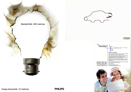
What is whitespace?
Often referred to as negative space, whitespace is nothingness. A void of content. Subsequently it doesn’t need to be white, just blank.
What’s so scary?
Well nothing! In print design, whitespace is used in abundance. You’ll often see blank pages, with nothing but an image in the bottom corner.
Whitespace gives the impression of high class. Think of the junk mail you receive through the door, it’s bright, it’s colourful, completely filled up without a mm of space to spare… and its cheap. Where does it go? Straight in the bin.
Now I can understand this in a way, the advertisers have to print hundreds of thousands of these leaflets just to see a small return in business (don’t forget, most go in the bin). So they print on small paper stock and have to cram all the information in, to cut costs. Whitespace is expensive. That’s why classy/rich companies can afford to use white space effectively.
But with websites it’s different. Space is free.
So what are we going to put in that gap?
NOTHING! And it’s certainly not a prime place for an advert.
It costs nothing extra to have a page twice as long. So let’s use this to our advantage.
Art galleries are experts in negative space
There’s a good reason galleries do not cram in paintings, for instance, they give each piece of work it’s own space completely separate from it’s neighbor. It makes the image stand out, un-encroached and allows you to concentrate on the piece.
With websites, whitespace leaves the page looking cleaner, fresher, and uncluttered. If the page was completely packed out with content, it’s difficult to know where to start. It’s like looking at a fairground and trying to decide what ride to go on first.
Why filling every gap is wrong
- It looks messy
- Visitors do not know where to start
- It looks cheap
Whitespace is good
- Clean and simple
- Visitors won’t get lost within the mess
- Looks classy
- Less likely to date (class is timeless)


Very nice article. As a footnote to this, whitespace is also ignored by search engines, so all the important information is still available for indexing.